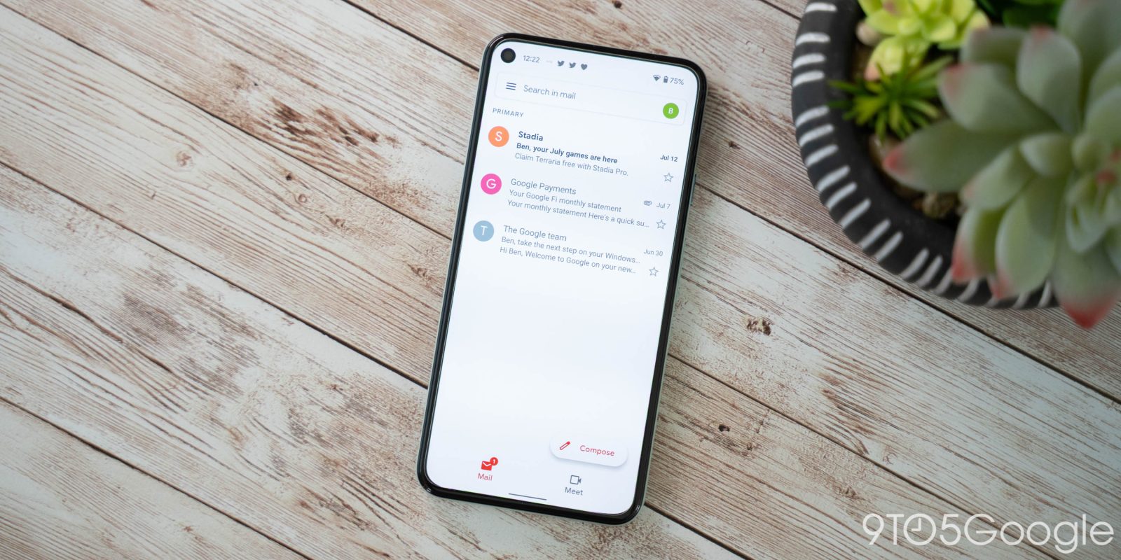
Last week, Google’s new design language started widely rolling out to Gmail for Android in some countries. As part of that launch, Google notably shrunk down the Material You bottom bar in Gmail.
Common Material You elements across first-party apps — Workspace clients especially — include a pill-shaped search field, rounded square FAB, and taller bottom bar, which uses a pill-shaped indicator to highlight what tab you’re currently viewing.
This new navigation element was in use when the redesign first came to Gmail, but it has now been shortened as part of the broader rollout. Spacing has been equally removed from the top and bottom, as well as between the icon and text label. As a result of this shrink, you do not get to see any more emails, but the Compose button does move down slightly. Meanwhile, the tap/ripple animation has been removed.
The end result is a bottom bar that’s not all too different from what came before. While the taller UI made for a stark visual contrast, it did not really change the experience of using and navigating apps.


L-R: Original Material You — Updated Material You — Google Material Theme
Gmail today is the only Material You app that has tweaked its bottom bar. Google Phone, Drive, and Photos still retain the taller element, though those redesigns have yet to become widely available. As such, it’s too early to tell whether Google has changed its mind about the taller bottom bar following real-world feedback.
