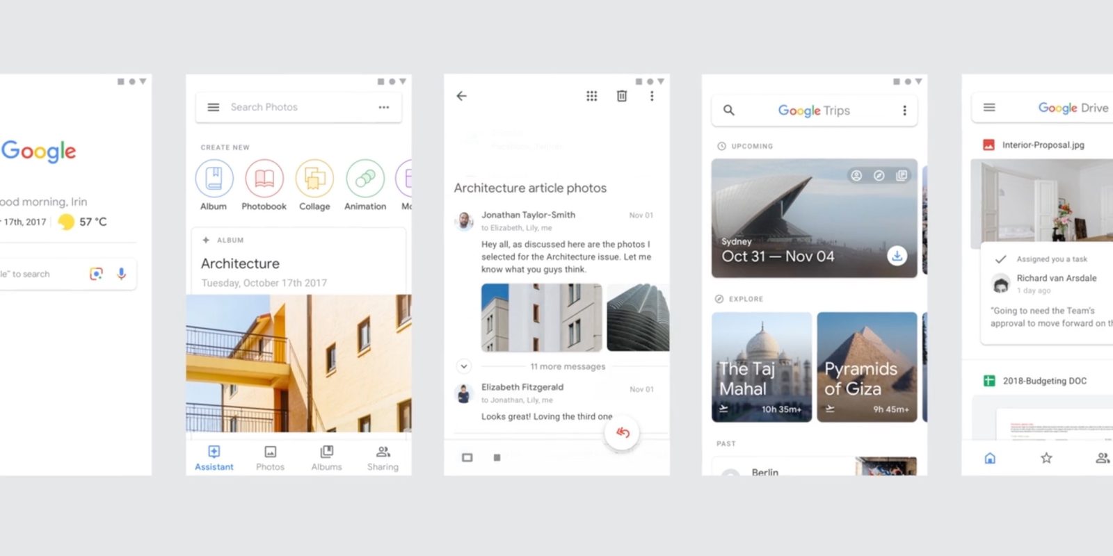
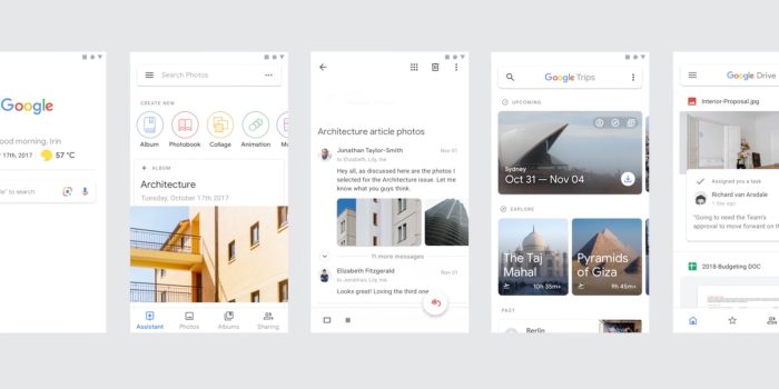
Google’s transition to update all of its apps with the Material Theme is well underway. A new video now shows off elements of the company’s new design language, while featuring various concepts for refreshed Google apps and services.
In the style of the original reel showed off with the 2014 launch of Material Design, this new video highlights various redesigned elements like search bars with slightly rounded corners, the bottom app bar, and Google’s new colorful centered FAB. It shows the design on both the web and mobile to demonstrate how the system scales to different devices.
The reel also dives into Google Sans, animating the small tweaks made to make the font work on a variety of screen sizes. It also demonstrates how it works in a variety of languages, sizes, and with symbols.
Google also highlighted its new system for icons. As particularly demonstrated in new bottom bars, icons are now outlines with the interior emptied out, resulting in a bolder look.
Color and Components are also touched on, with the latter available for all developers to user in their own apps and services. This includes the new rounded tab indicator, buttons that feature animation, and more.
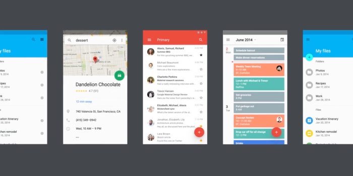
Towards the end, the video imagines how Google’s various apps will be updated for the Material Theme from the previous Material Design. Bare in mind that concepts shown in the 2014 reel never became actual products or designs.
- Gmail for Android looks like a shrunken down version of the web revamp with a bottom app bar that includes a navigation drawer to the left, FAB to compose new Email at center, and search. Photos and attached files appear inline from the app’s main list of emails, while the bottom bar is also leveraged when inside a conversation.
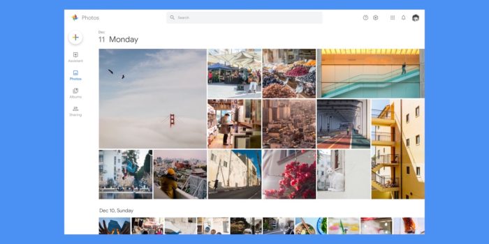
- Google Photos on mobile features redesigned icons on the bottom bar and the rest of the interface, while a web variant is shown off for the first time. Similar to the current design, there is a side rail with updated icons and a new FAB up top to presumably upload pictures or create albums. Meanwhile, dates are larger and more prominent to separate photos.
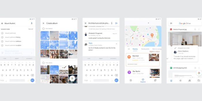
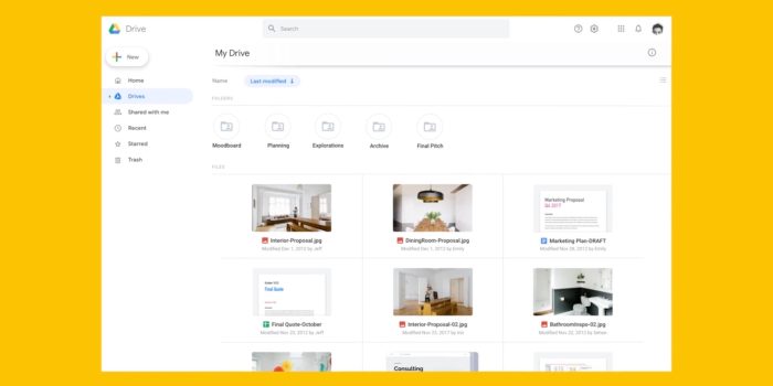
- Google Drive shows off an interesting new main feed design on mobile where the Home tab notes an image file with a carousel of comments. Other visible sections in the bottom bar include Starred and Sharing, though the app retains a navigation drawer merged with the search bar up top. Tapping a file includes a new rounded bottom sheet that notes the comments and features Smart Replies.
- Google Trips has a notable concept that includes carousels of upcoming trips, as well as an Explore section for other cities. Your Past trips are below that, with the app also implementing a bottom bar.
- Google app features the current greeting, date, and weather found at the top of Assistant’s visual redesign and Pixel Launcher, with a search bar underneath that includes shortcuts to quickly launch both Lens and voice search. Meanwhile, while searching, inline locations are featured in the result of suggested queries.

FTC: We use income earning auto affiliate links.
