Earlier this year, the unified Gmail web client replaced the Material Theme “Compose” button. Google is now reverting that decision following user feedback.
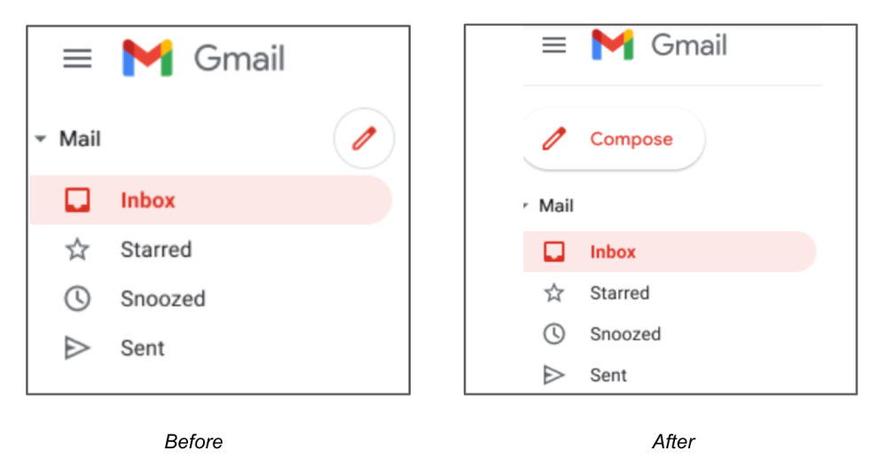
At the moment, the red button for writing a new email appears to the right of the “Mail” dropdown menu. This “smaller, icon-only” approach was introduced in April “for all users of Chat in Gmail on the web.” It was easily missed, especially if you have the label/folder drawer expanded. As such:
We’ve heard from you that the original, larger version of the button is more intuitive and will be going back to that option starting November 3, 2021.
In addition to being wider, the extended FAB will be elevated and appear above “Mail.” However, in the image shared today, Gmail is not bringing back the four-color ‘plus’ button that was synonymous with the Google Material Theme design era. It’s already gone from mobile Gmail, Drive, and Docs/Sheets/Slides, but it remains used by Keep. Instead, the outline-style pencil icon will be used.

This tweak to Gmail’s Compose button is already rolling out for some users and applies to both personal Google Accounts and Workspace customers.
The change comes as web Gmail is set to get a broader navigation overhaul in the near future. That update sees “Compose” always visible in the top-left corner above Mail, Chat, Spaces, and Meet. That left-most strip remains static, while labels/folders and the Spaces list (in that view) appears to the right of it. It’s unclear if Google is planning to use Material design 3 / material You’s more rectangular buttons.
