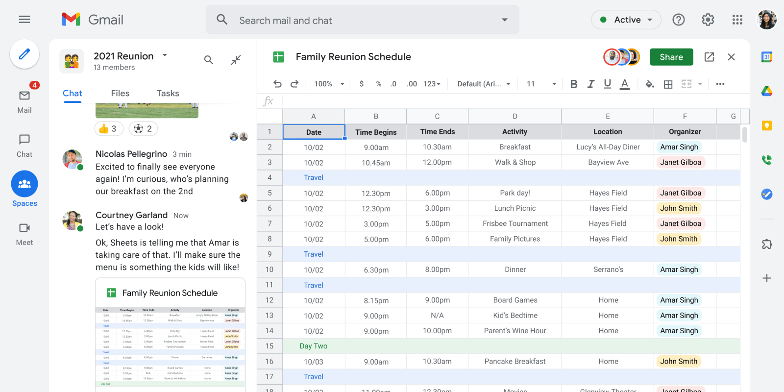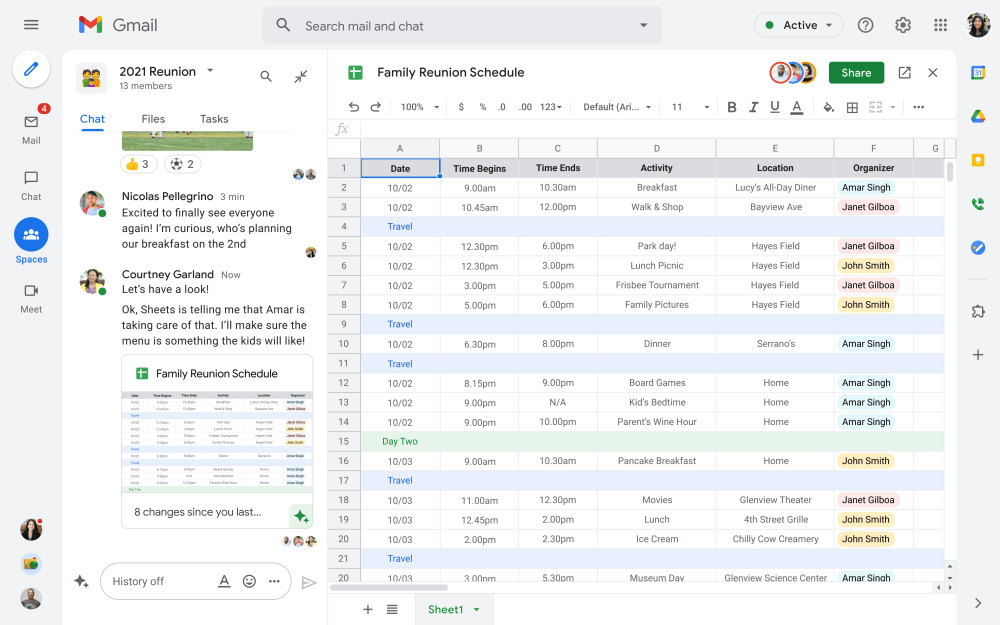
A key part of Google’s integrated vision for productivity is routing everything through the Gmail apps. As part of Workspace becoming available “for everyone,” Gmail is getting streamlined navigation on the web, while Google Chat’s “Rooms” will soon be called “Spaces.”
This streamlined navigation, which will be available later this summer, comes as “Gmail” is now home to Google Chat messaging and Meet video calling. Currently, expanding the Gmail navigation drawer reveals Mail (folders & labels), Chat (one-to-one & group conversations), Rooms (larger conversations), and Meet (start or join) sections that you can expand/collapse.
Web Gmail is moving to a navigation rail (like in Google Photos) with round buttons for Mail, Chat, Spaces (more on that below), and Meet. Once you tap into a view, another drawer appears to the right with familiar navigation. For example, you get the standard list of folders and labels for Gmail and a list of recent conversations for Chat and Spaces.
That said, the top-left corner, underneath the hamburger button, shows an email compose FAB, while avatars of people you’ve just talked to can appear at the bottom. Otherwise, the app bar that features the search field, active status, and other settings, as well as the right rail with add-ons for Calendar, Drive, and more, are unchanged.
Google imagines this as being an easier way to switch between different apps while staying on one page. You can think of it as the bottom bar on Gmail for Android and iOS coming to the web. Meanwhile, the main app you’re interacting with is at the center inside a sheet that features rounded corners at the top.

Google’s key announcement today is how Chat “Rooms” — their Slack and Teams competitor — in Gmail are being rebranded to “Spaces” — a name that might sound familiar. It’s meant to be “a dedicated place for organizing people, topics, and projects in Google Workspace,” if not your “new home,” for work. You can have a chat window — with tabs for Files and Tasks — appear on the left side of your screen while a document takes up the rest of it.
Over the summer, we’ll evolve Rooms to become Spaces and launch a streamlined and flexible user interface that helps teams and individuals stay on top of everything that’s important.
The company sees them as being useful for the times when an email or chat needs to get bigger. It includes features like in-line topic threading, custom emoji/GIFs and other expressive reactions, message pinning, and presence indicators and custom statuses from Calendar while fully integrating with files and Tasks. You can also run polls and integrate workflows with third-party bots.

This Rooms upgrade will also feature user roles and moderation tools. Spaces can be easily browsed within a domain, though it will also be available for free users.
Spaces can provide a place to fuel knowledge sharing and community building for teams of all sizes, where all the relevant information, conversations, and files for a project can be organized, and where topics—even at the organization level—can be intelligently moderated. With the ability to pin messages where everyone can see them, Spaces will play a crucial role in helping people stay connected and informed as hybrid work evolves.


