During a session at Cloud Next 2018, Google showed off Gmail for Android’s upcoming Google Material Theme update. To match the recent web revamp, the mobile version of Gmail will gain traditional desktop features like density options and quick attachments in the inbox view.
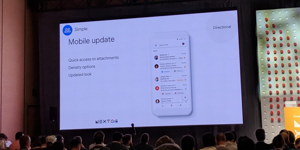
Classified as a “directional” slide, the design shown off adopts a stark white theme and background. Compared to the big web revamp earlier this year, the mobile update is “smaller” in scale, according to the Gmail team.
In line with Google’s recent Material Theme direction, Gmail’s previous red accents are gone. Up top is a new full-width search bar that features the navigation drawer to the left and a profile avatar at the right. At the bottom-right is the new white, multi-colored FAB that’s seen on the web and other recent Google apps.
This mobile design detailed at today’s session is still “directional” and what the team is moving towards, but not necessarily the final iteration that will be rolling out to users. However, there are certain features that will be coming as part of this “Mobile update.
Like on the web, the new inbox view immediately lists images, files, and other attachments for quicker access. The new Gmail is also adding density options, like on the web, to help people decide between how much information is visible on the screen.

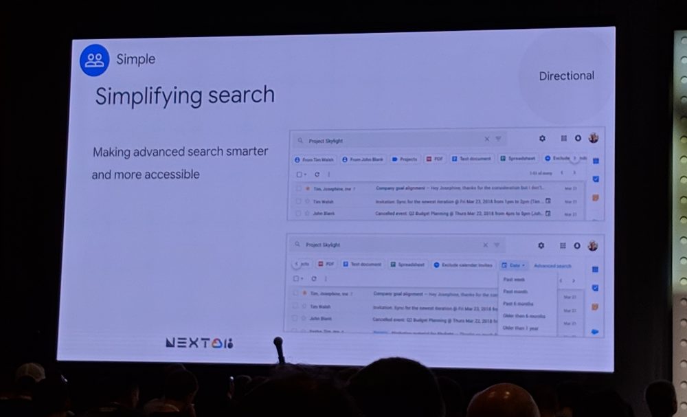
Meanwhile, Gmail on the web is working on more advanced search features starting with simplifying the interface with a bottom carousel that can suggest contacts, attachment types, and other filters
Additionally, during a Q&A on the state of Inbox, “there’s no particular change” according to the Gmail team. In terms of enterprise, G Suite and enterprise customers are encouraged to use Gmail, Google’s flagship email product. All successful experimental features will make its way to Gmail.

FTC: We use income earning auto affiliate links.
