Google launched a completely redesigned Gmail on the web, featuring the Google Material Theme, earlier this year. We’ve been fans of it for quite a while from purely an aesthetic perspective, but it’s definitely had some places where it feels like Google chose form over function. No longer!
Now, Google’s letting you hide that pesky new Gmail sidebar that you never use.
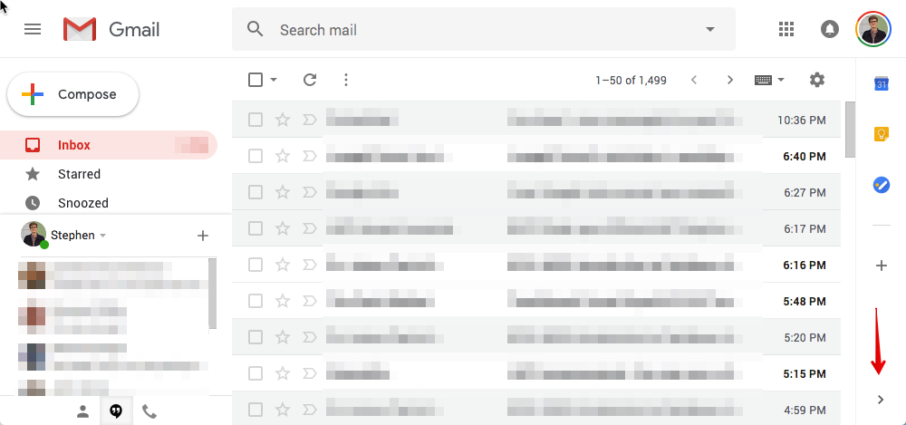
It’s one of the most obvious new features when you open the new Gmail for the first time. Along the right side of the screen, right below your Google account avatar, there’s a new sidebar that gives you quick shortcuts to Gmail companion apps. The three that are there by default are Google Calendar, Google Keep, and Google Tasks.
It goes without saying that some people don’t use any of these apps — and many of those, in fact, never use any third-party Gmail apps at all. For them, this sidebar is entirely useless. Until now, though, you were stuck with it, sticking out like a sore thumb and shoving apps in your face that you don’t want.
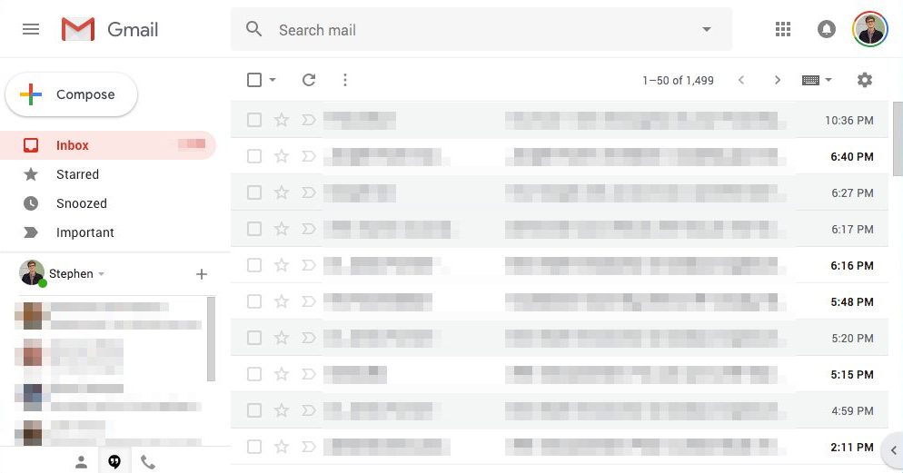
Now, you can hide it if you want. Just click the little arrow (it pops up and says “hide side panel” if you hover over it — I guess that’s the sidebar’s formal name). If you do this, it will, unsurprisingly, hide the sidebar. Bonus: It will remember your preference, so if you open up Gmail again, it will still be hidden.

What it looks like with the Gmail sidebar hidden
If you do use the “side panel,” though, then good for you. You don’t need to do anything and you weren’t one of the surely tens of people that went out of their way to click the “submit feedback” option in Gmail and requested this little feature.
Let us know what you think of this nifty new feature in the comments.
