1 Comment
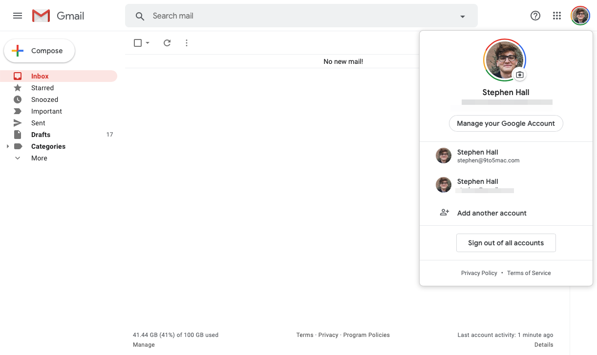
Google is today rolling out a redesigned version of the account switcher across its web apps. If you use Gmail, Drive, Calendar or other Google apps on the web (on your personal account, no G Suite accounts yet), you may notice the new design which matches recent mobile designs.
The account switcher is just the latest of many elements of Google’s many web apps to adopt a Google Material Theme-based aesthetic. Functionally, the new design is pretty much identical. You can, however, sign out of all accounts with just one click if you’re currently signed in to multiple.
Here’s what the old version looked like compared to the new one that’s now rolling out. You can also check it out for yourself over at Google.com — let us know in the comments if you’re seeing the new design yet on your personal account. Old account switcher New account switcher
As you can see, the new design looks very similar to other account switcher UI designs that have appeared over the last couple years in Google’s mobile apps. It’s nice to see that the ages-old design has finally been retired in favor of something a bit nicer.
